427 App Mockup Ad Examples

App mockup ads show the product's own screens on a phone as the creative. Browse the examples below, then read how brands pick the one screen that sells.

A creator stands in front of a greenscreen, explaining a psychological study about self-perception. He shows screenshots of a Wikipedia article and then demonstrates an app that uses facial scanning technology to provide an attractiveness rating. The video ends with a call to download the app.
Live · 9 daysVideo
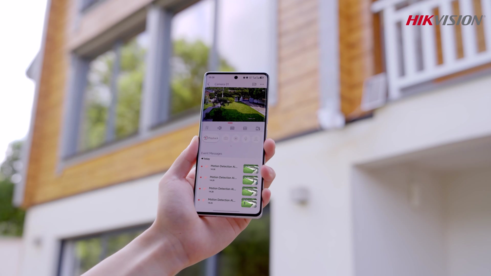
A hand holds a smartphone displaying the Hikvision app interface. The app shows a live feed from a security camera overlooking a well-maintained lawn and house, along with a list of motion detection alerts. The background features a modern house with wooden siding and large windows. The Hikvision logo is visible in the upper right corner of the image.
Ended · 17 daysVideo
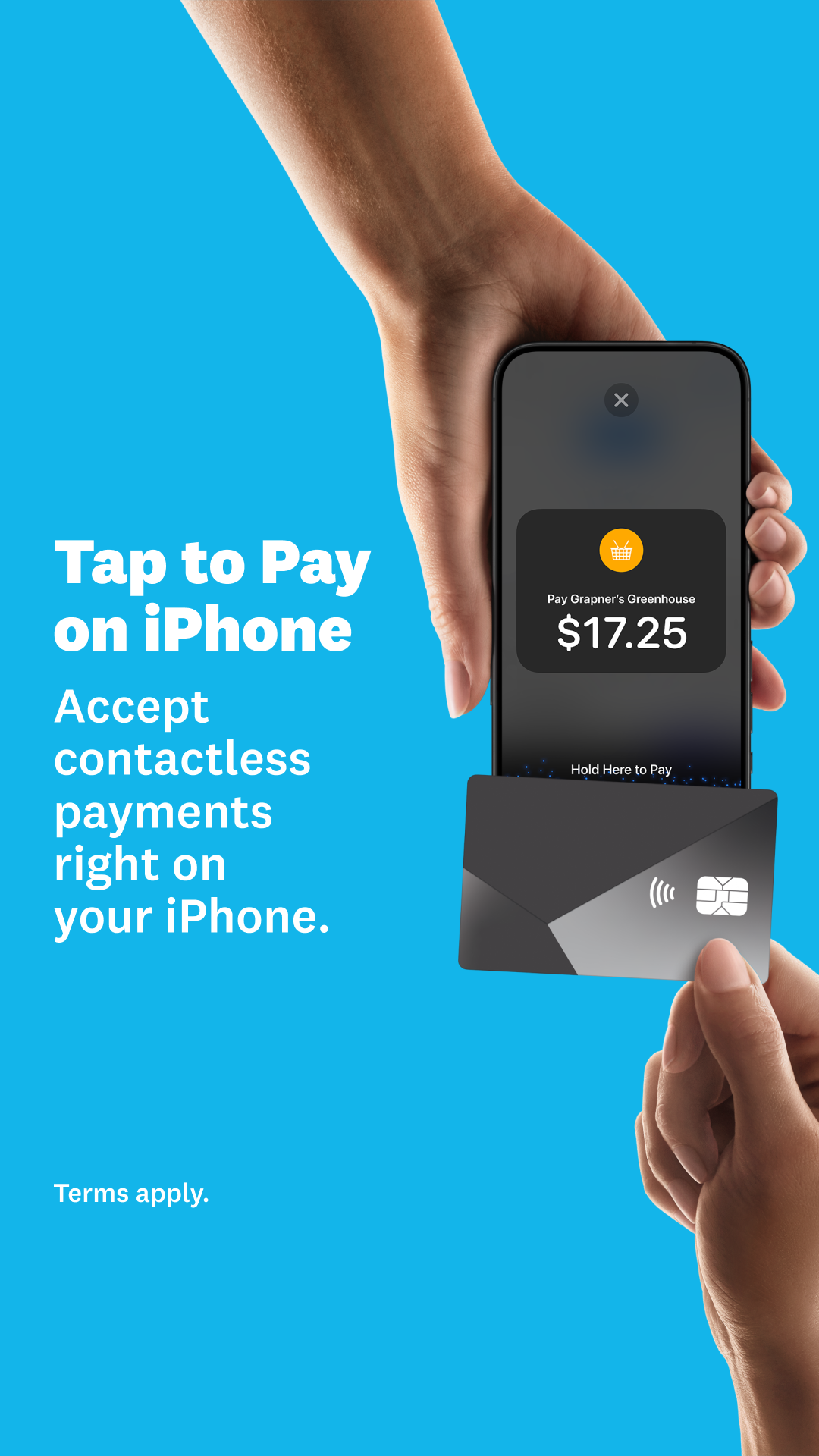
A hand holds an iPhone displaying a payment screen for $17.25 at "Grapner's Greenhouse." Below the phone, another hand holds a credit card, with the text "Hold Here to Pay" visible on the phone screen. To the left of the phone, large white text reads "Tap to Pay on iPhone" and "Accept contactless payments right on your iPhone." The background is a solid bright blue. The bottom left corner has the text "Terms apply."
Ended · 114 days
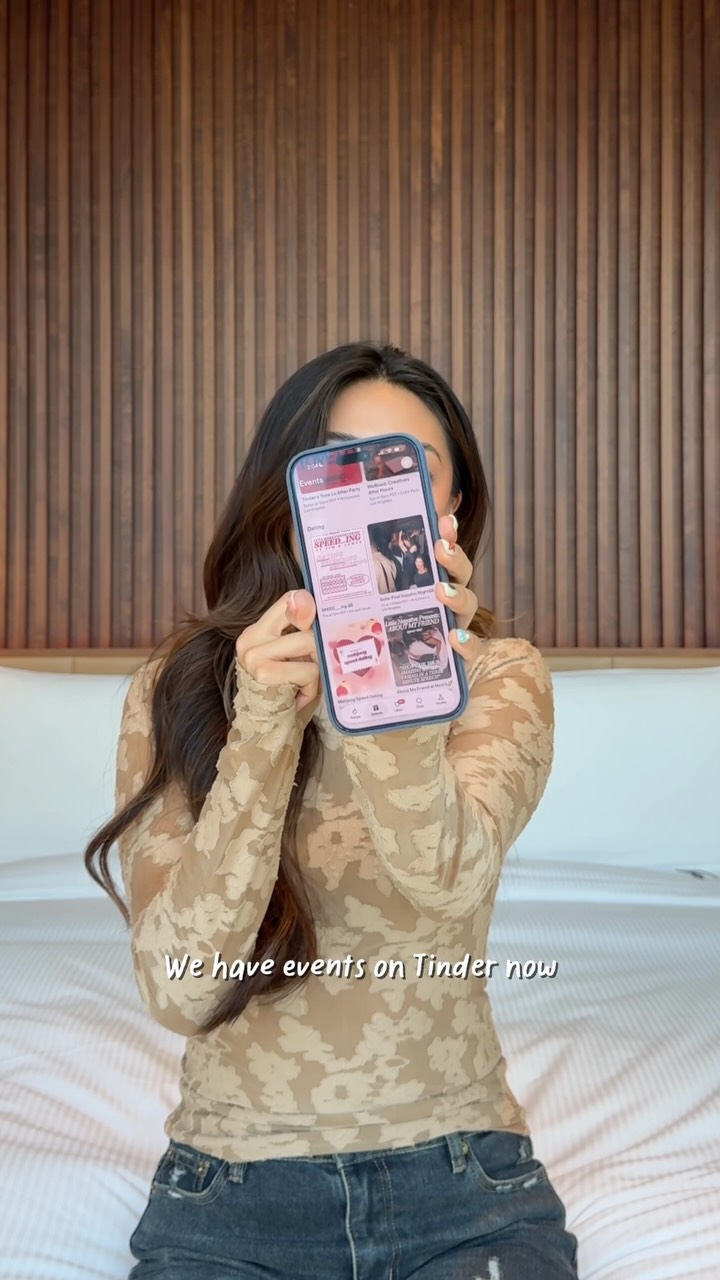
A woman sits on a bed, holding up a smartphone to the camera, obscuring her face. The phone screen displays the Tinder app's 'Events' section, showcasing various dating events. Text overlaid on the image reads, "We have events on Tinder now." The woman is wearing a patterned long-sleeved shirt and jeans. The background features a wooden slatted headboard.
Live · 14 daysVideo
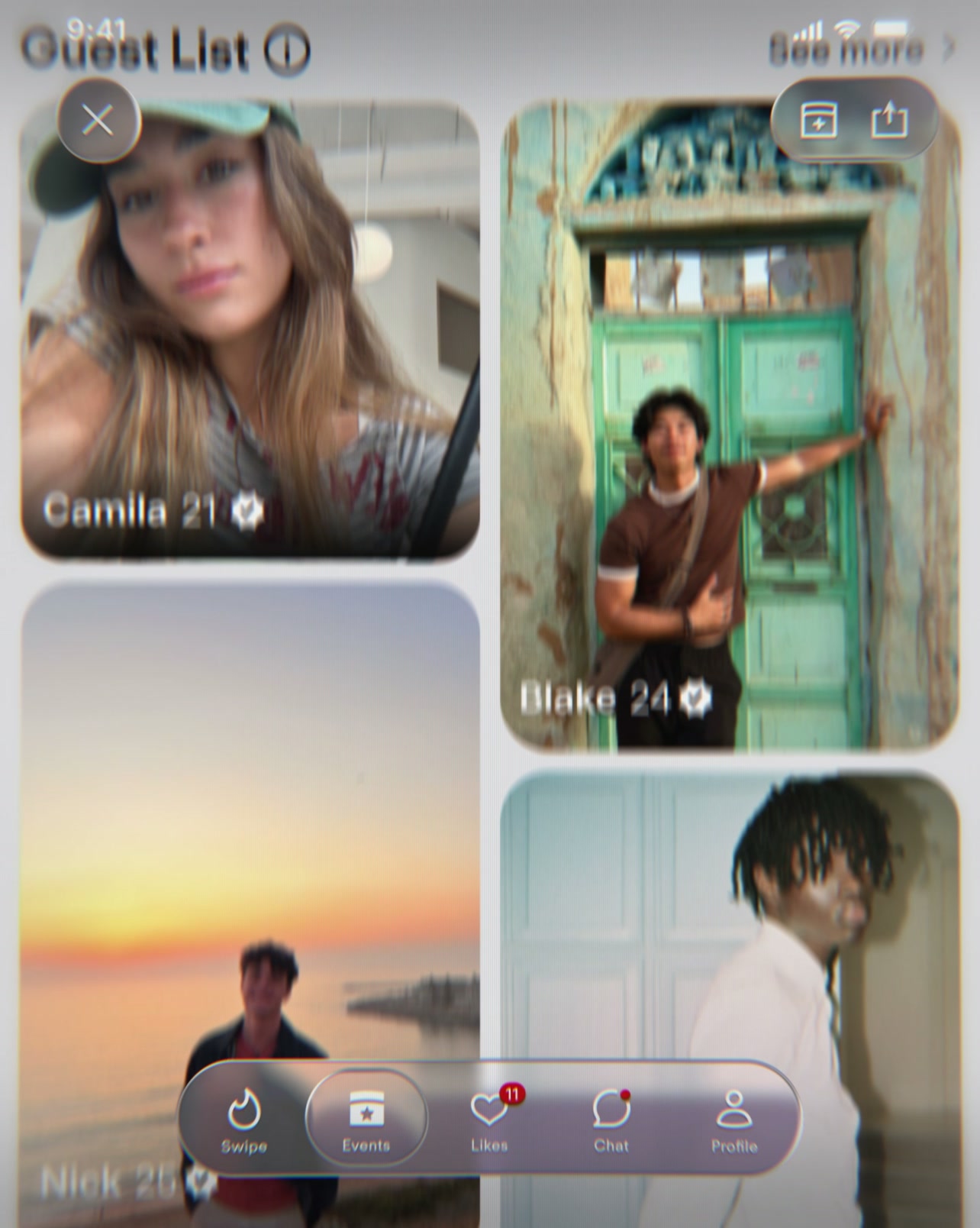
The creative displays a mock-up of a dating app interface, resembling Tinder's 'Guest List' feature. It shows profile cards of several individuals, including Camila (21), Blake (24), and Nick (20s), with their names and ages overlaid. The bottom of the screen features navigation icons for 'Swipe', 'Events', 'Likes', 'Chat', and 'Profile'. The overall visual style is that of a user-generated content feed within an app.
Live · 26 days
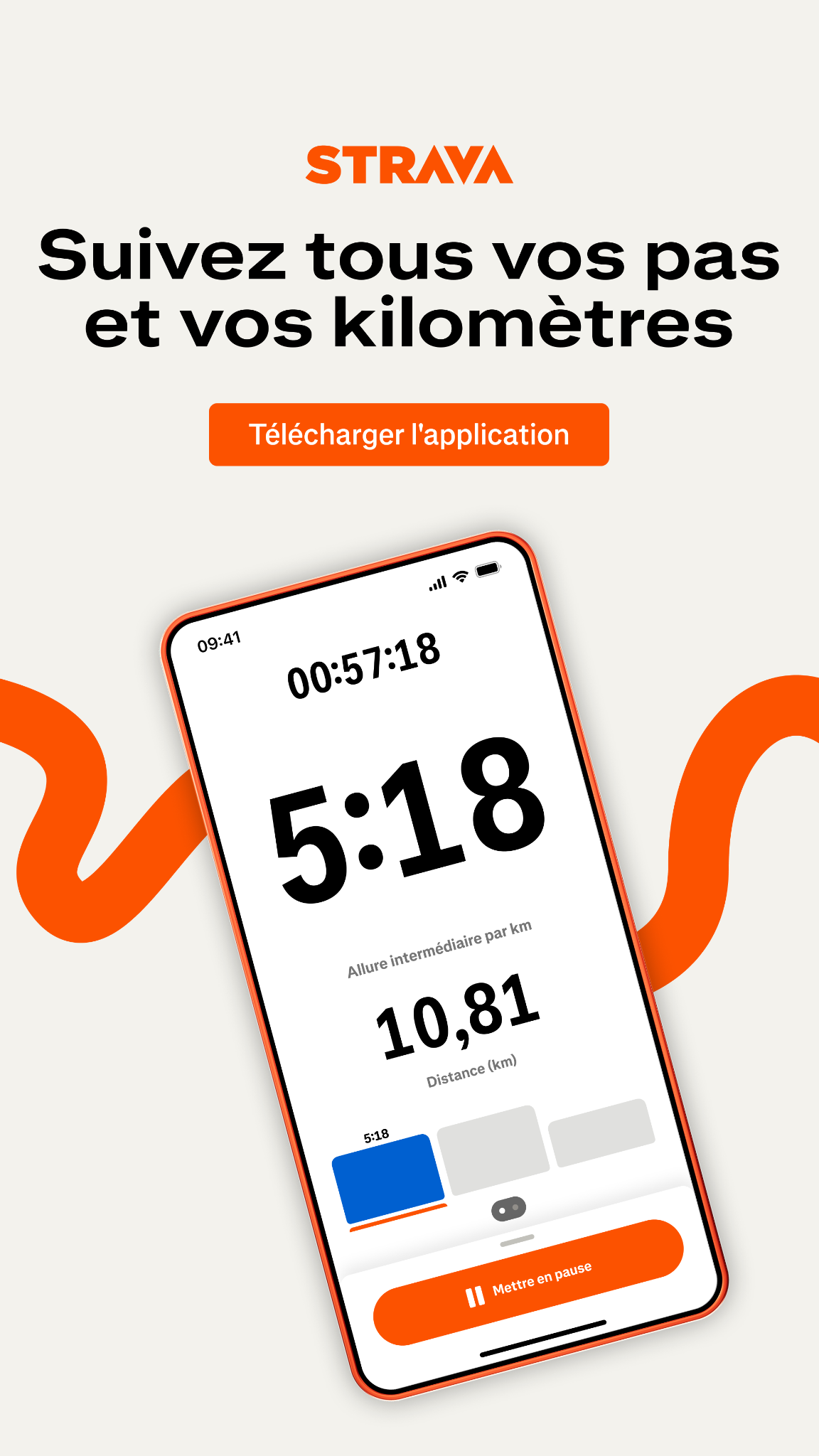
The Strava app logo is displayed at the top of the screen. Below it, the headline reads "Suivez tous vos pas et vos kilomètres" (Track all your steps and kilometers). An orange button below the headline says "Télécharger l'application" (Download the application). The main part of the creative shows a smartphone displaying the Strava app interface, which shows a running timer, distance, and pace. The phone is set against a light background with abstract orange wavy lines.
Ended · 72 days
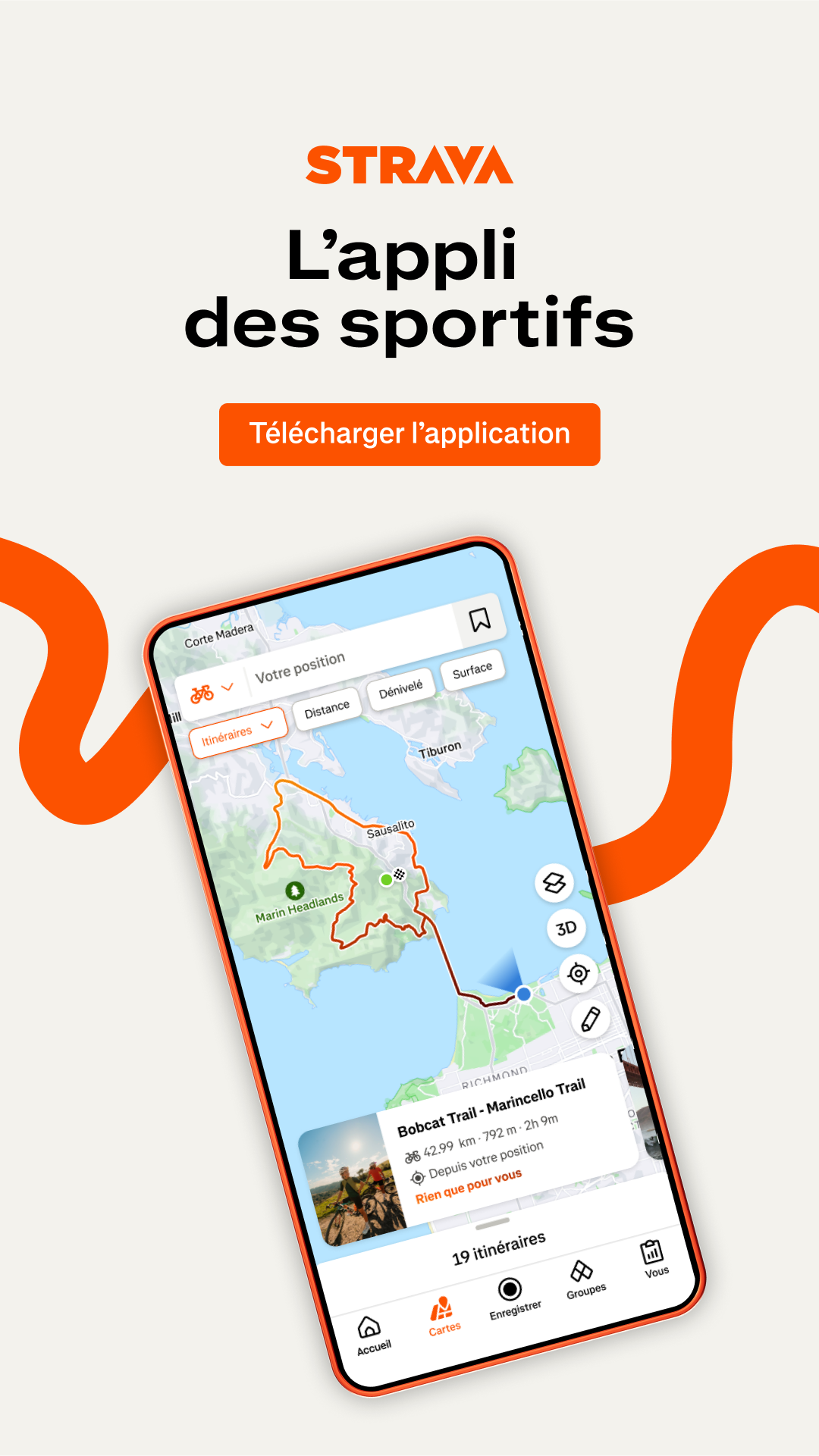
The Strava logo is at the top of the screen, followed by the text "L'appli des sportifs". Below this, there is an orange button that says "Télécharger l'application". The main part of the creative is a smartphone displaying the Strava app interface, which shows a map with a route highlighted. The app screen includes details about a trail, distance, and duration, along with a photo of cyclists. The phone is framed by abstract orange shapes.
Live · 95 days
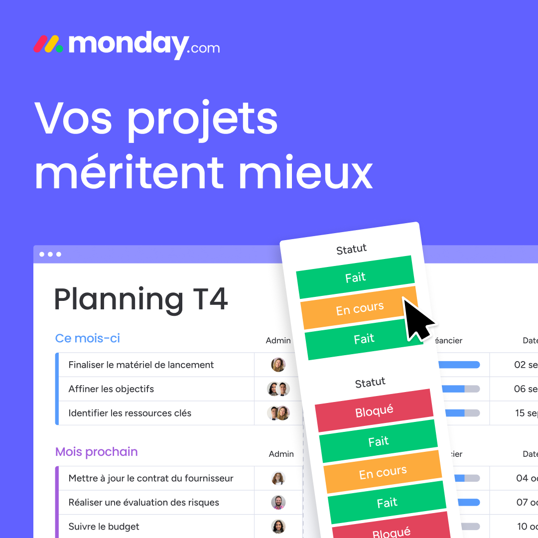
The monday.com logo is in the top left corner. Large white text on a purple background reads "Vos projets méritent mieux". Below this, a screen mockup shows a project planning interface with tasks and statuses. A pop-up menu displays task statuses like "Fait" (Done) and "En cours" (In progress), with a cursor hovering over "En cours". The overall visual suggests a project management tool designed to improve productivity.
Ended · 90 days
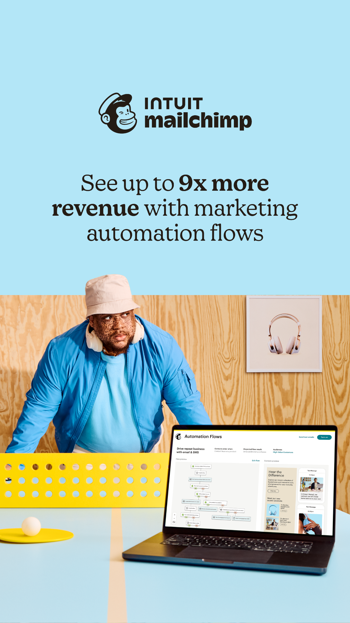
A man wearing a blue jacket and a bucket hat is looking off to the side. He is positioned in front of a light blue background with a wooden wall pattern behind him. On the wooden wall, there is a framed picture of headphones. A laptop is open in the foreground, displaying a marketing automation flow chart. The text on the screen reads "See up to 9x more revenue with marketing automation flows" and the Intuit Mailchimp logo is visible at the top.
Ended · 55 days
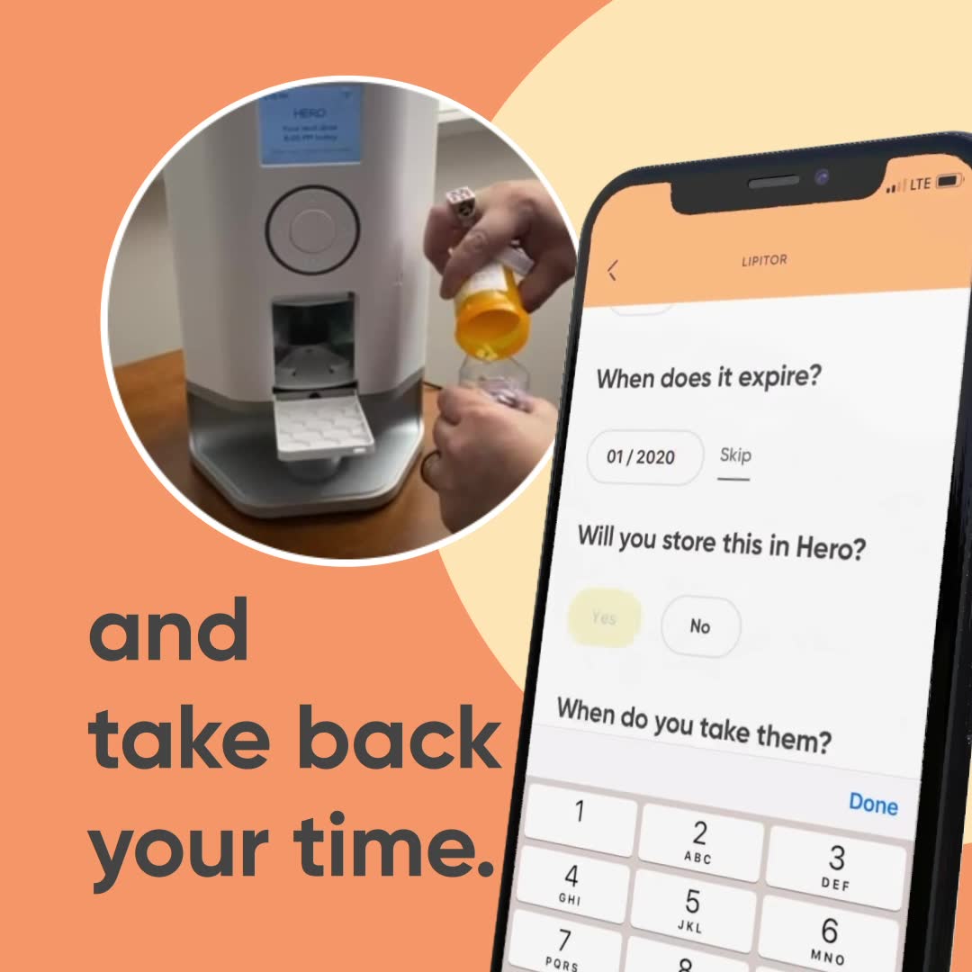
The creative features a split image. On the left, a person is pouring pills from a prescription bottle into a cup, with a white pill dispenser device called 'Hero' in the background. On the right, a smartphone displays an app interface with questions about medication expiration and storage, and a keypad. Large text overlay on the left side reads 'and take back your time.'
Live · 65 daysVideo
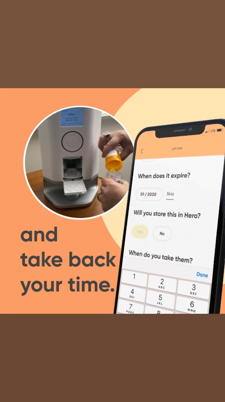
A split screen shows a medication dispenser on the left and a smartphone screen on the right. The dispenser is white with a gray base, and a person's hands are shown pouring pills into it. The smartphone screen displays an app interface with fields for "When does it expire?", "Will you store this in Hero?", and "When do you take them?". Large text on the left side of the image reads "and take back your time."
Live · 75 days
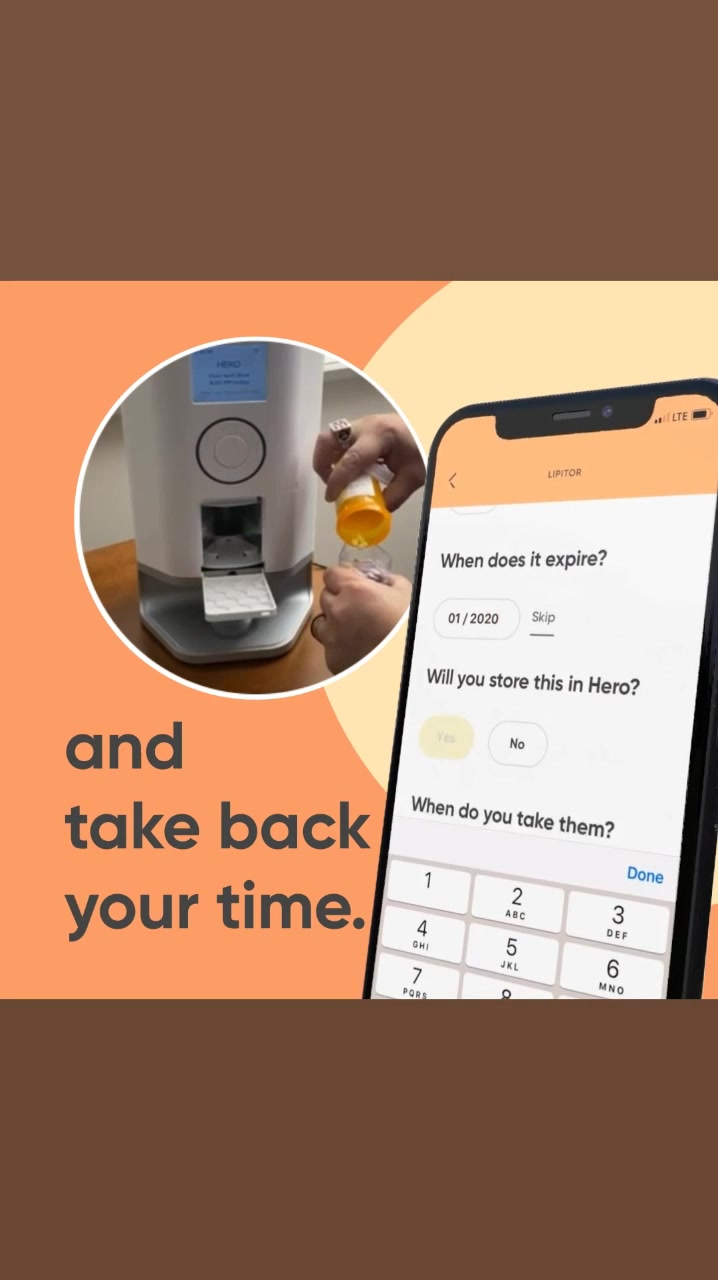
The creative features a split screen. On the left, a close-up shows a hand pouring pills from a prescription bottle into a white medication dispenser. On the right, a smartphone displays an app interface with fields for medication expiration date and storage preference, followed by a keypad. Large, bold text on the left side of the screen reads "and take back your time."
Live · 88 days
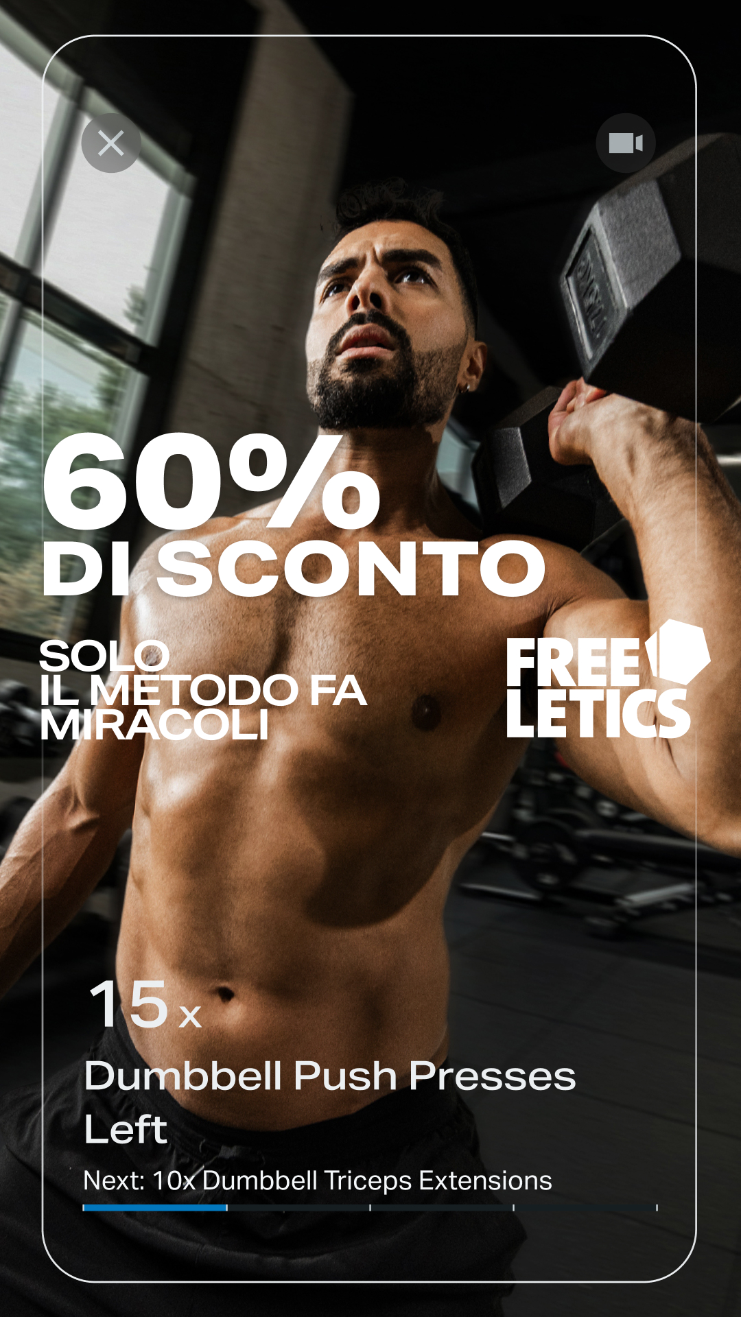
A man is shown performing a dumbbell exercise in a gym. Large white text overlays the image, stating "60% DI SCONTO" (60% DISCOUNT) and "SOLO IL METODO FA MIRACOLI" (ONLY THE METHOD WORKS MIRACLES). The Freeletics logo is also visible. Below the man's torso, text indicates "15x Dumbbell Push Presses Left" and "Next: 10x Dumbbell Triceps Extensions", suggesting a workout interface.
Ended · 151 days
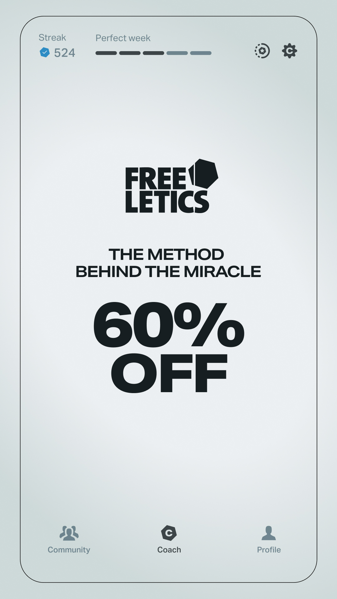
The creative is a mockup of a phone screen displaying the Freeletics app. The prominent text in the center reads "60% OFF" in large, bold font. Above this, smaller text states "THE METHOD BEHIND THE MIRACLE." The Freeletics logo is also visible at the top. The bottom of the screen shows icons for "Community," "Coach," and "Profile." The offer is a discount on the app's services.
Live · 285 days
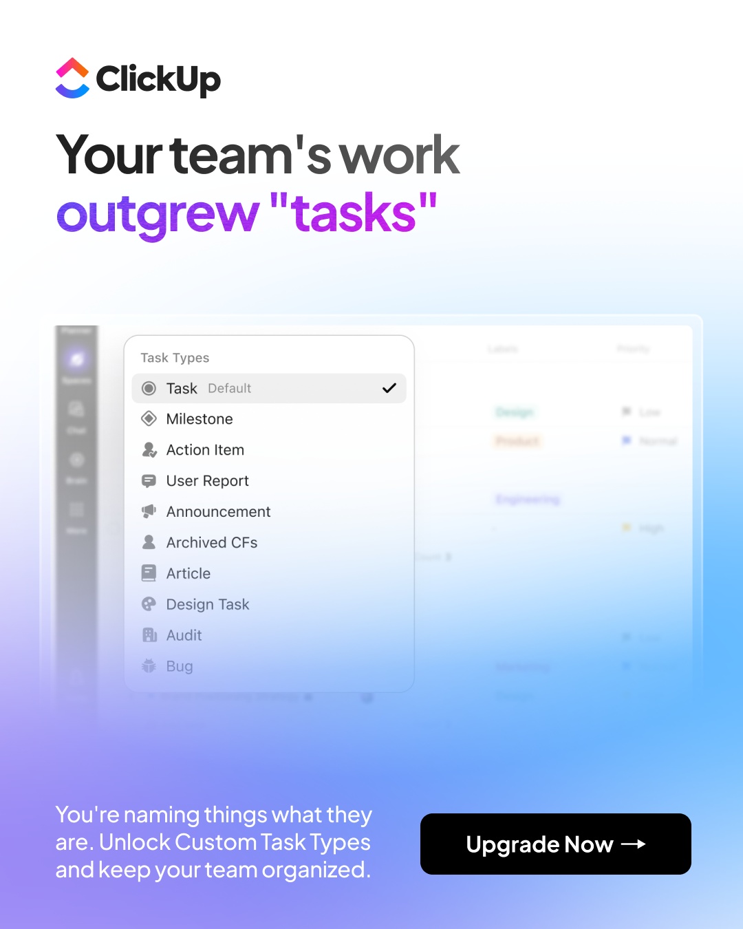
The ClickUp logo is at the top left. The headline "Your team's work outgrew "tasks"" is displayed prominently in large text. Below the headline, a screenshot of the ClickUp app is shown, featuring a dropdown menu for "Task Types" with various options like "Task," "Milestone," and "Action Item." At the bottom left, text reads "You're naming things what they are. Unlock Custom Task Types and keep your team organized." A button on the bottom right says "Upgrade Now →."
Ended · 27 days
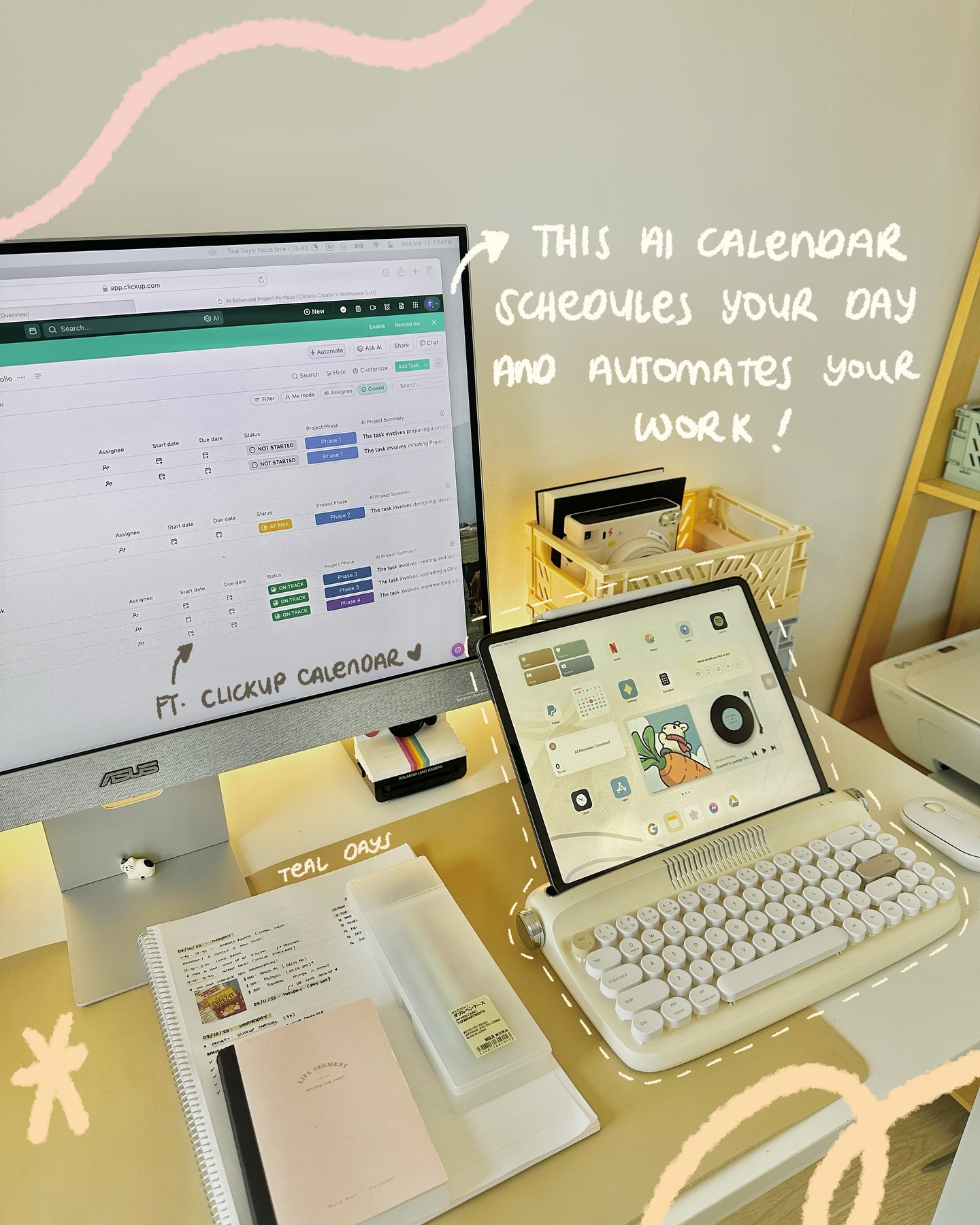
A computer monitor displays the ClickUp app interface, showcasing a project management dashboard with tasks and statuses. To the right, a tablet displays various app icons and a cartoon graphic. Handwritten text overlays the scene, stating "THIS AI CALENDAR SCHEDULES YOUR DAY AND AUTOMATES YOUR WORK !" and "FT. CLICKUP CALENDAR". The overall aesthetic is bright and organized, suggesting a productive workspace.
Ended · 236 days
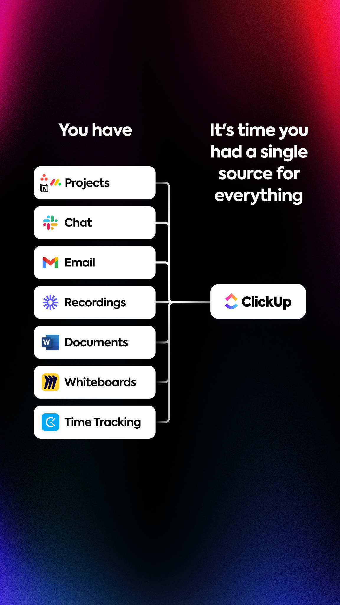
A diagram shows multiple applications like Projects, Chat, Email, Recordings, Documents, Whiteboards, and Time Tracking on the left side, all connected by lines to a single box on the right labeled "ClickUp". The text "You have" is positioned above the list of applications, and the text "It's time you had a single source for everything" is positioned to the right of the diagram, serving as the hook.
Ended · 292 days
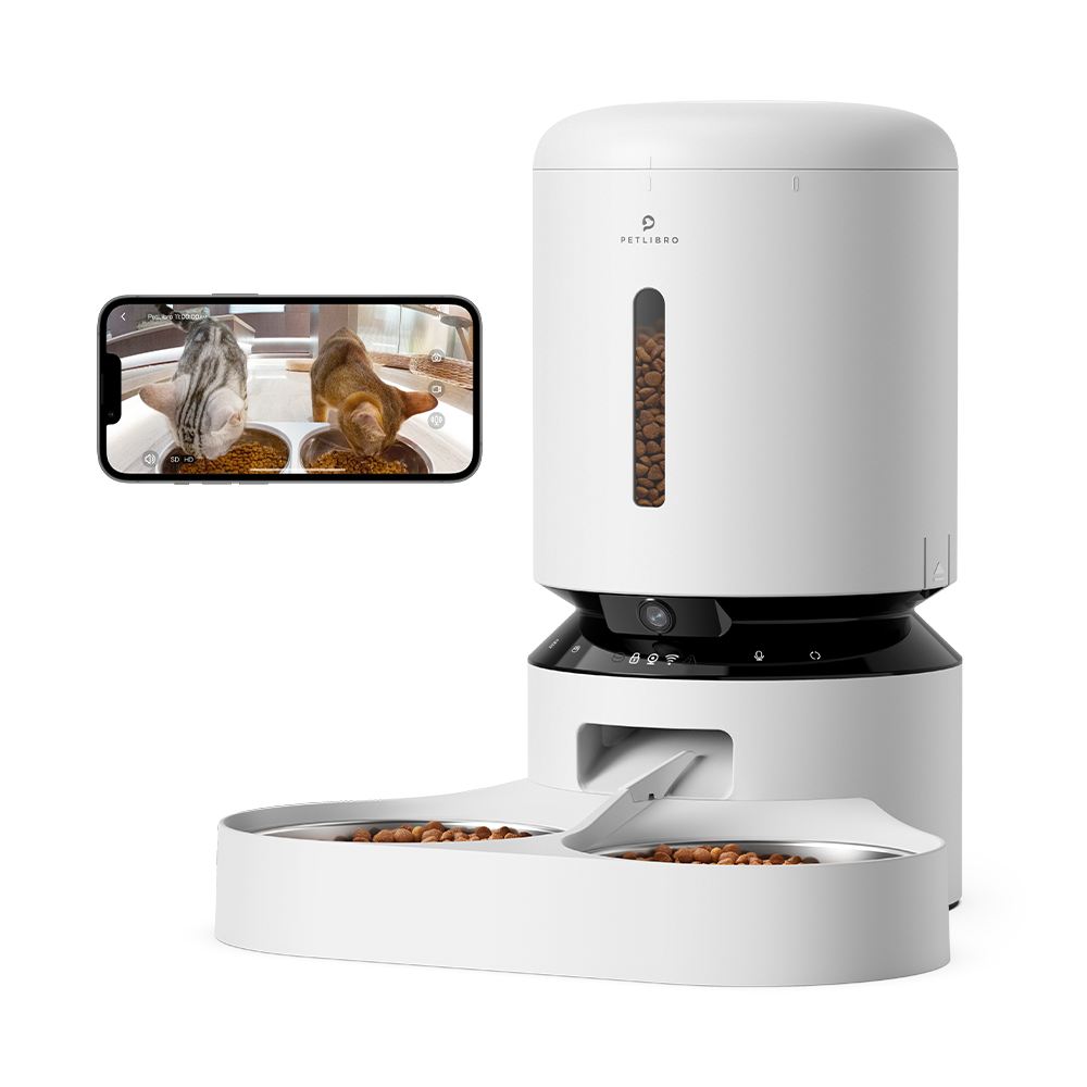
A white automatic pet feeder is shown on the left, with a smartphone displaying a live feed of two cats eating from bowls on the right. The pet feeder has a transparent window showing kibble inside and a camera lens at the base. The smartphone screen shows a split view of two cats eating from their bowls, with app interface elements visible. The on-screen text announces a 20% discount with code NEW20 for new customers on all bestsellers, and states that smart pet care begins now.
Ended · 31 days
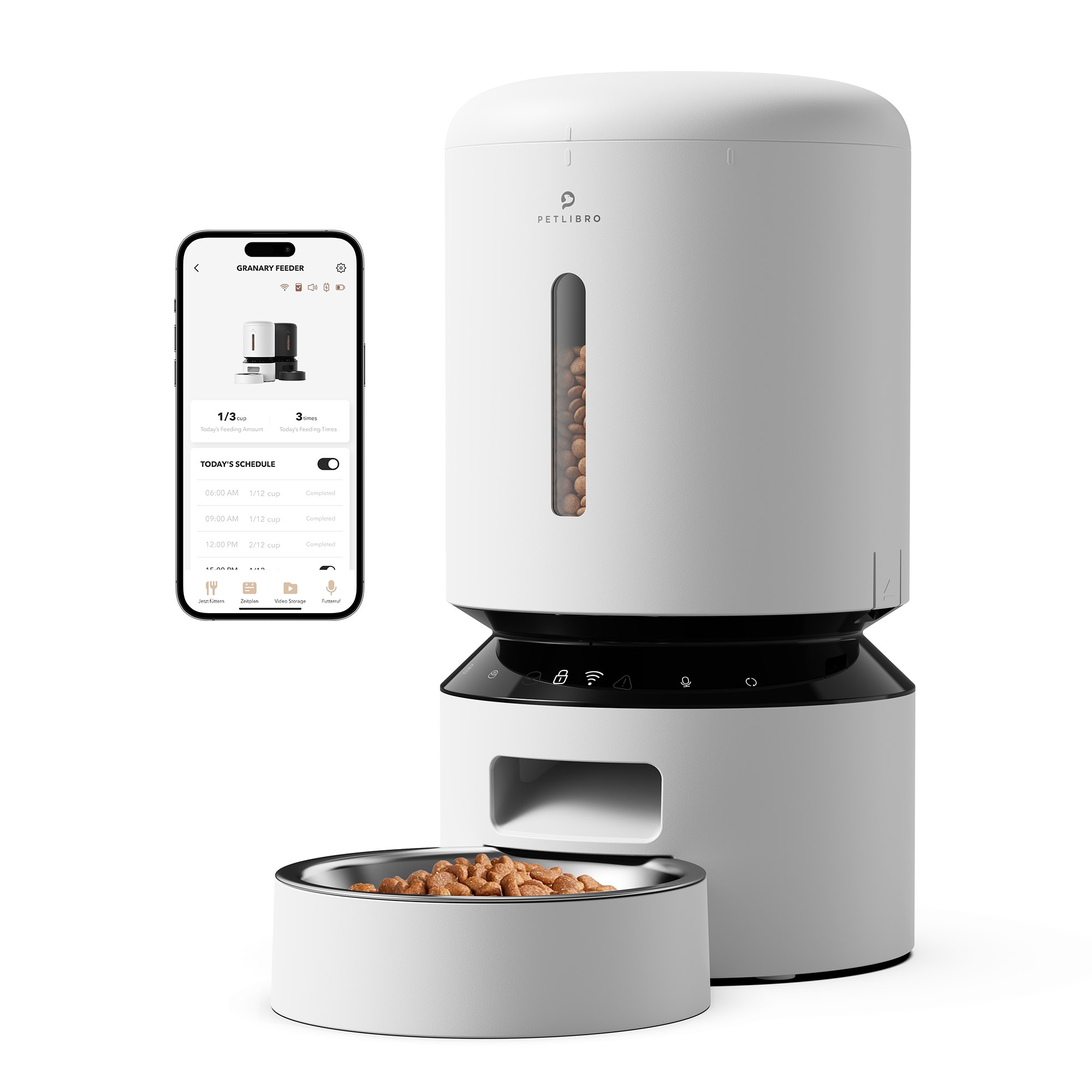
A white automatic pet feeder with a clear window showing kibble is shown next to a smartphone displaying the feeder's app. The app shows a feeding schedule and options like "Feed Now" and "Schedule." Text overlays on the image announce a discount of up to 35% on bestsellers, with specific codes for 20% off bestsellers and 15% off bundles.
Ended · 44 days
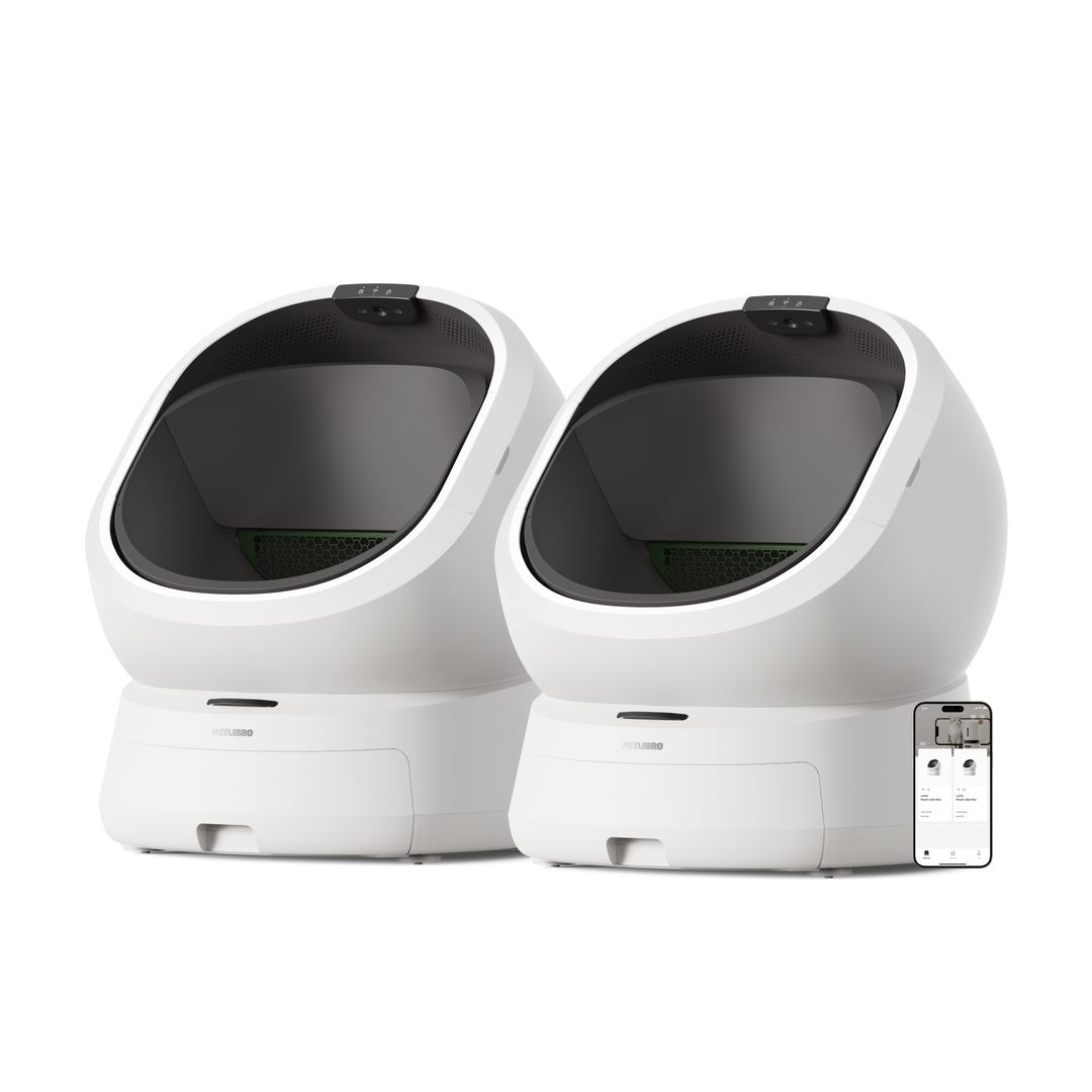
Two white, modern automatic litter boxes are shown side-by-side against a white background. A smartphone displaying the Petlibro app interface is positioned in the lower right corner, overlapping the right litter box. The app screen shows various metrics and controls related to the litter box. The overall presentation is clean and highlights the product's technology and app integration.
Live · 45 days

What are App Mockup ads?

An app mockup ad puts the product's real interface on a phone and makes that the picture. The screen might show a dashboard, a chat, a tracker or a checkout, with a headline above it and sometimes a hand holding the device. It lets a viewer judge the product at a glance, which matters for software, where there is nothing physical to photograph.

When to use App Mockup ads

  • You sell an app or a software product, and the screen is the product.
  • Your interface is a selling point, because it is simple, good looking or built around one clear action.
  • You want a static ad that shows what the viewer gets after the install, not just a promise.
  • You are testing angles quickly and can swap the screen, the headline or the background without a shoot.
  • You are reviewing competitor ads in your category and want to see which screens other apps choose to show.

App Mockup ad best practices

  1. Show one screen, not the whole app

    Pick the single view that proves the headline. A phone with six tiny panels cannot be read at feed size, while one clear screen can be understood in a second.

  2. Make the screen text legible

    Viewers read the interface the way they read the headline. Enlarge the key numbers or labels, and trim the demo data so nothing is lost at small sizes.

  3. Use realistic data

    Placeholder names and zero values make the product look unfinished. Fill the screen with plausible, specific content that fits the audience you are targeting.

  4. Match the headline to the screen

    The words above the mockup should name the exact outcome the screen shows. A mismatch between claim and interface makes people doubt both.

  5. Frame it with a hand or a backdrop

    A phone floating on a flat colour looks like a store listing. A hand, a desk or a simple scene gives it context and helps it feel native in the feed.

Brands running App Mockup ads

Niches with the most App Mockup ads

App Mockup ads: frequently asked questions

What is an app mockup ad?

An app mockup ad uses the product's app screens on a phone as the main visual. The aim is to let the viewer see the interface before they install it.

What is the difference between an app mockup and a screen recording?

A mockup is a still or lightly animated arrangement of screens, usually with a headline. A screen recording is a video of the interface being used. Brands often test both for the same app.

Which screen should an app mockup ad show?

Show the screen that proves the main benefit, such as a finished result, a clean dashboard or the moment the app does its job. Avoid onboarding and settings screens, which say little about why anyone should want it.

Can physical products use app mockup ads?

Yes, if there is a companion app that is part of the appeal, such as a smart device or a fitness tracker. Show the app beside the product so the ad explains how the two work together.

Where do I find app mockup ad examples?

The gallery above lists app mockup ads from real brands. Sign in for free to open the first 100 ads of every list, or ask your AI agent to find app mockups in the app and software niche and compare their headlines.

Other formats